Turning returns into opportunities to save the sale
Redesigning the returns and exchanges experience within Tulip's Point of Sale to simplify transactions, reduce friction for store associates and help retailers retain revenue when customers exchange previously purchased items.
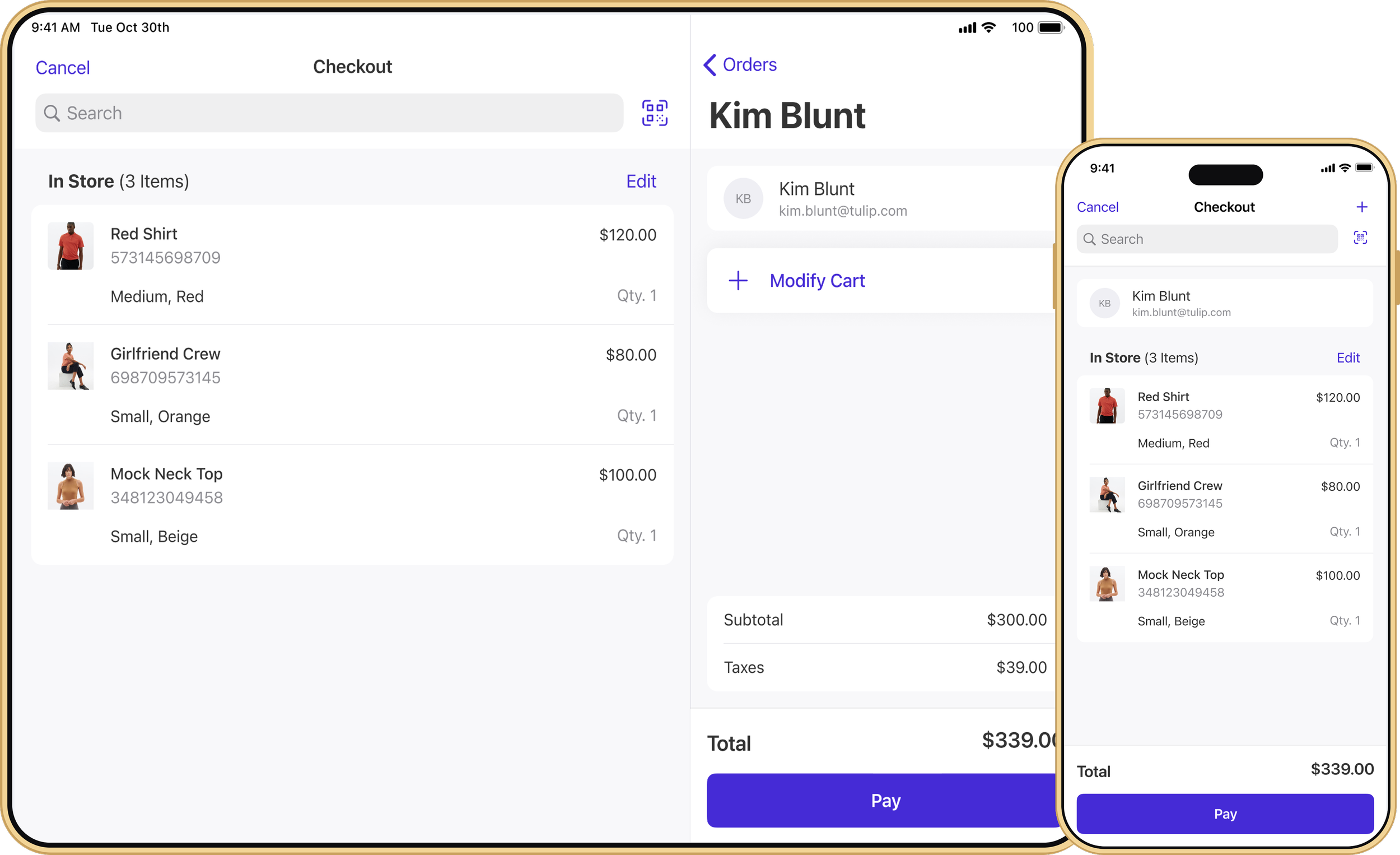

Redesigned Tulip’s Point of Sale (POS) application with a focus on the checkout and payment experience. The redesign reflects how store associates actually work, it simplified a crowded interface, and created a more scalable checkout experience for both in-store and delivery orders in the mass market and luxury retail space.
ROLE
Lead Product Design
PLATFORM
iOS
CLIENTS
Coach
Michael Kors
Purolator
Revolve
SSENSE
TEAM
6 Developers
1 Product Manager
1 QA Engineer
THE CHALLENGE
Checkout Wasn't Organized Around How Associates Actually Work
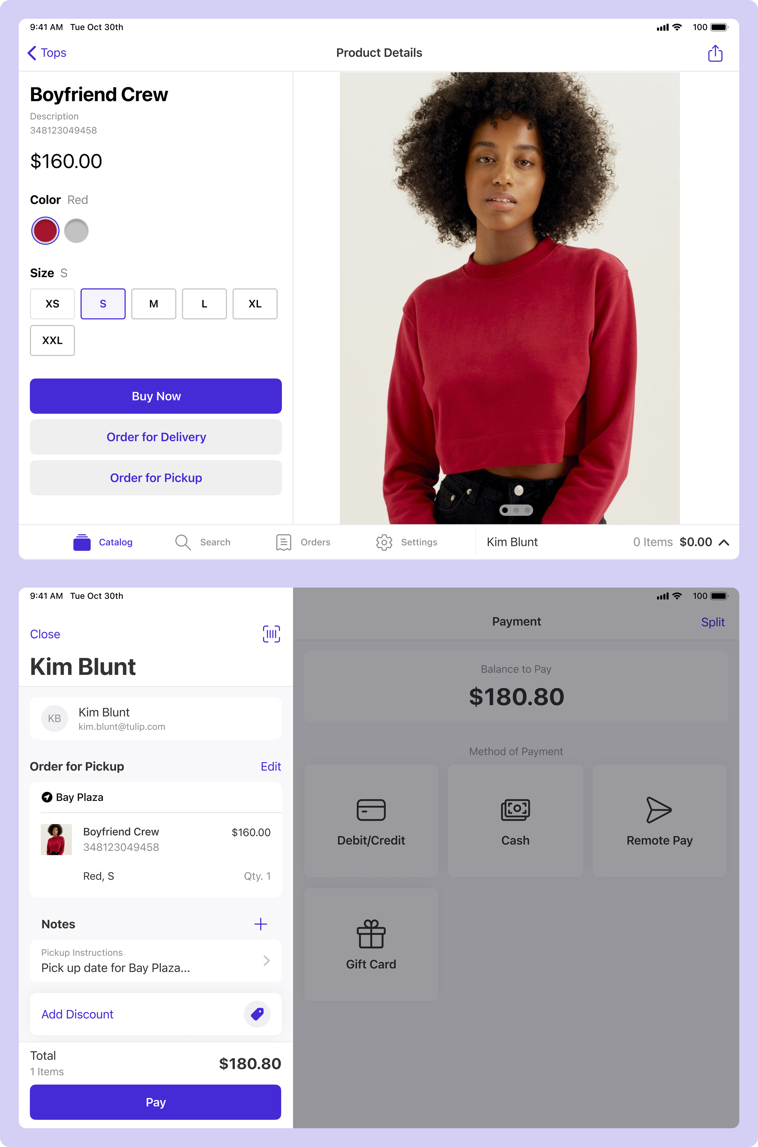
Exchanging an item was more complicated than it needed to be. Store associates had to process a refund for the original purchase before creating an entirely new transaction for the replacement item.
For shoppers, this meant receiving a refund and making a separate payment, even when they simply wanted to exchange one product for another. For retailers, the disconnected experience created unnecessary friction during an important opportunity to retain a sale.
The challenge was to bring returns and purchases into a single, intuitive transaction while accounting for the complexity of different payment methods, order histories and retail policies.
The redesign put checkout at the center of the POS experience, with a focus on making transactions faster, clearer and easier to manage. A more spacious layout gives larger baskets room to breathe, while secondary cart actions are tucked into a dedicated modal to keep the experience focused. Search is integrated directly into checkout, helping associates quickly find and add products without interrupting the transaction.
SOLUTION
A Checkout First POS
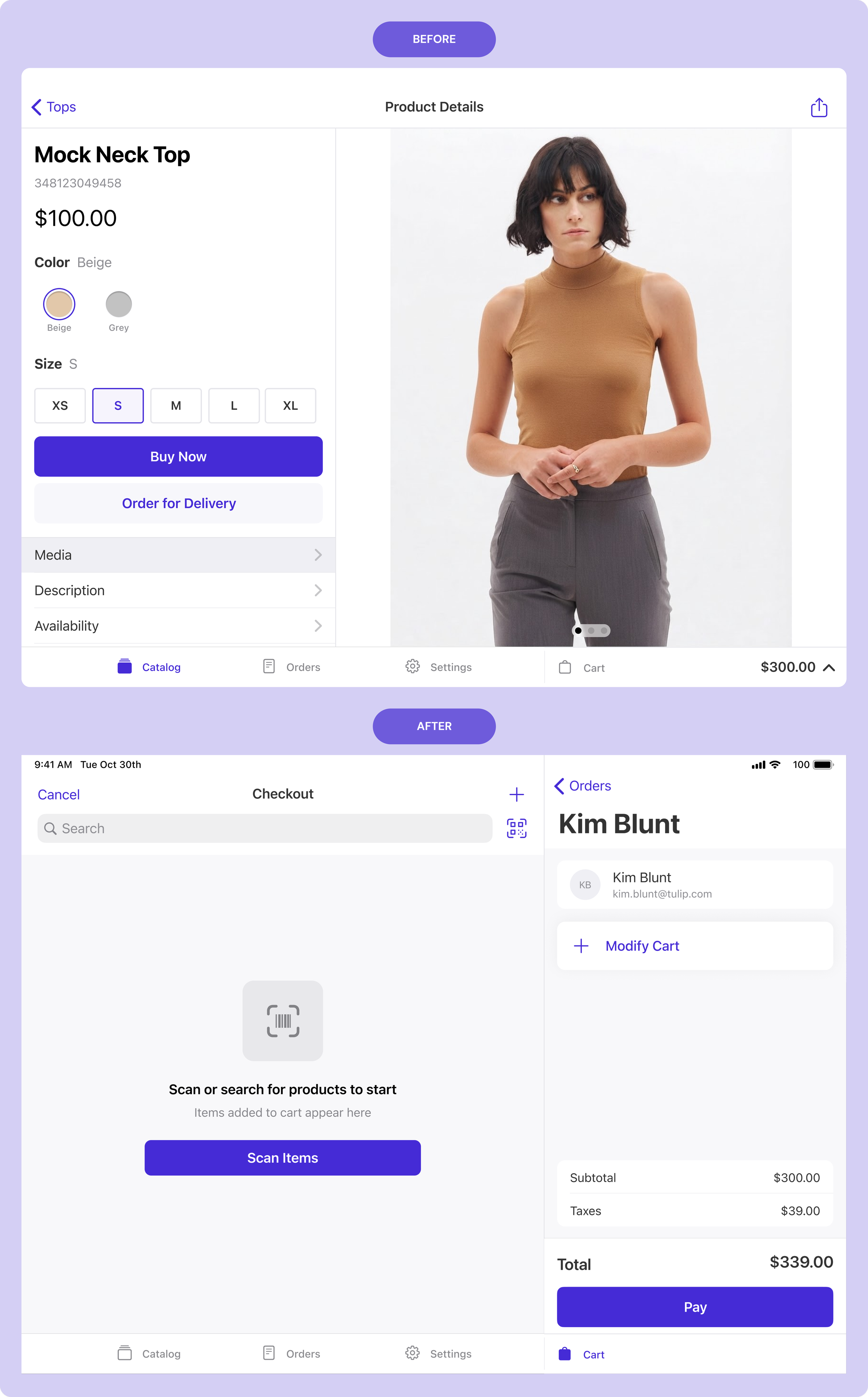
I redesigned checkout around the needs of higher-volume retail, with a focus on faster transactions, larger baskets and higher average order value. Search moved directly into checkout to make adding products easier, the cart was given more room to scale, and infrequently used order actions were consolidated into a modal to reduce clutter.
BEFORE
The catalog was the landing view, reflecting a browse-first retail experience where associates moved from product discovery into checkout.
AFTER
Checkout became the primary landing page, giving associates immediate access to search, scanning, the cart and payment so they could start and complete transactions from one central workspace.
SOLUTION
Making Larger Transactions Easier
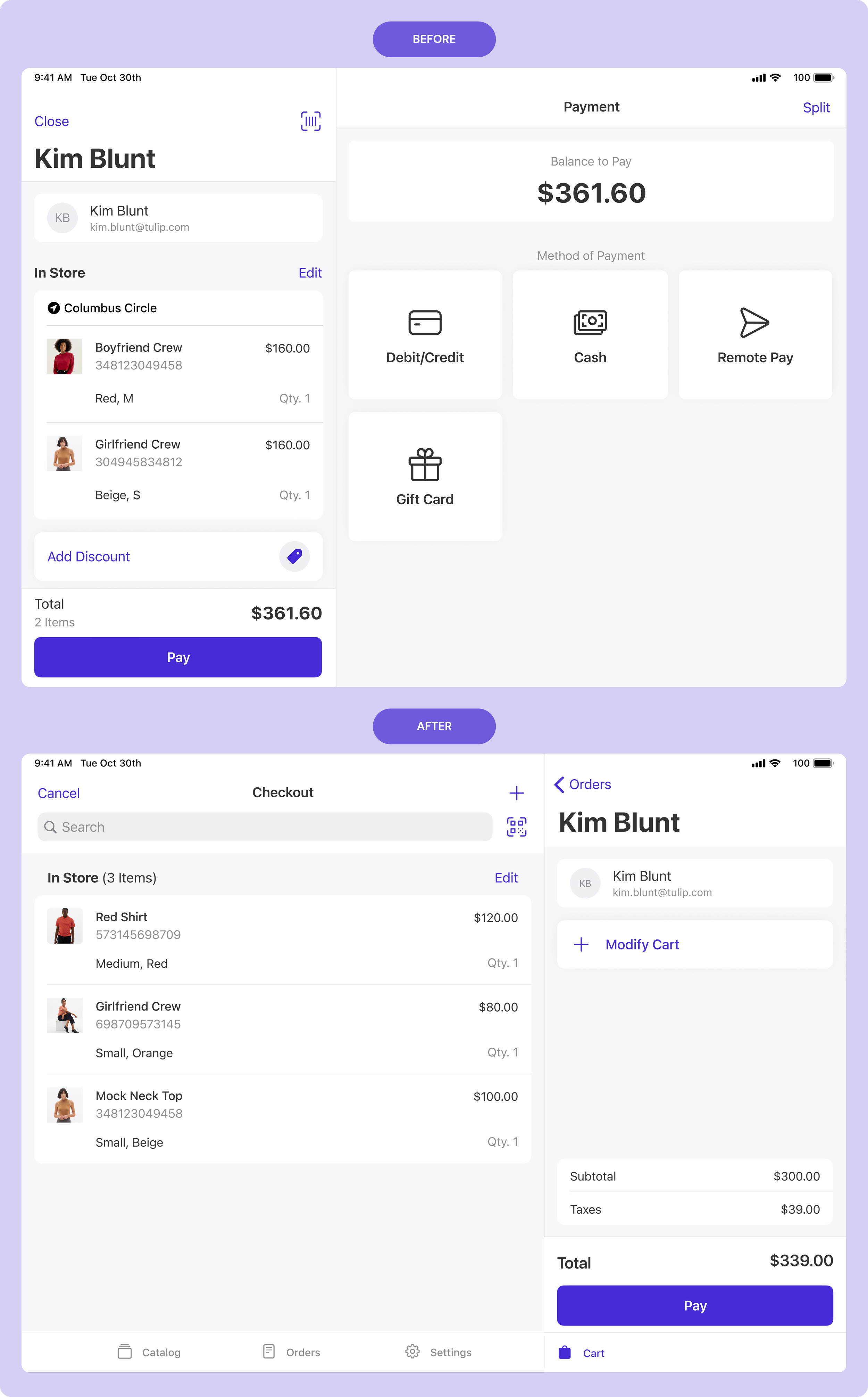
BEFORE
Cart items were compressed into a narrow panel, making larger baskets difficult to scan, while low-frequency actions such as discounts and other cart modifications competed for the same limited space.
AFTER
The checkout layout gives the basket significantly more room, making multi-item orders easier to review at a glance. Secondary cart actions were consolidated to reduce clutter, while an AI-powered search bar lets associates quickly find products, customers or existing orders without leaving checkout.
SOLUTION
Payment When It Matters
BEFORE
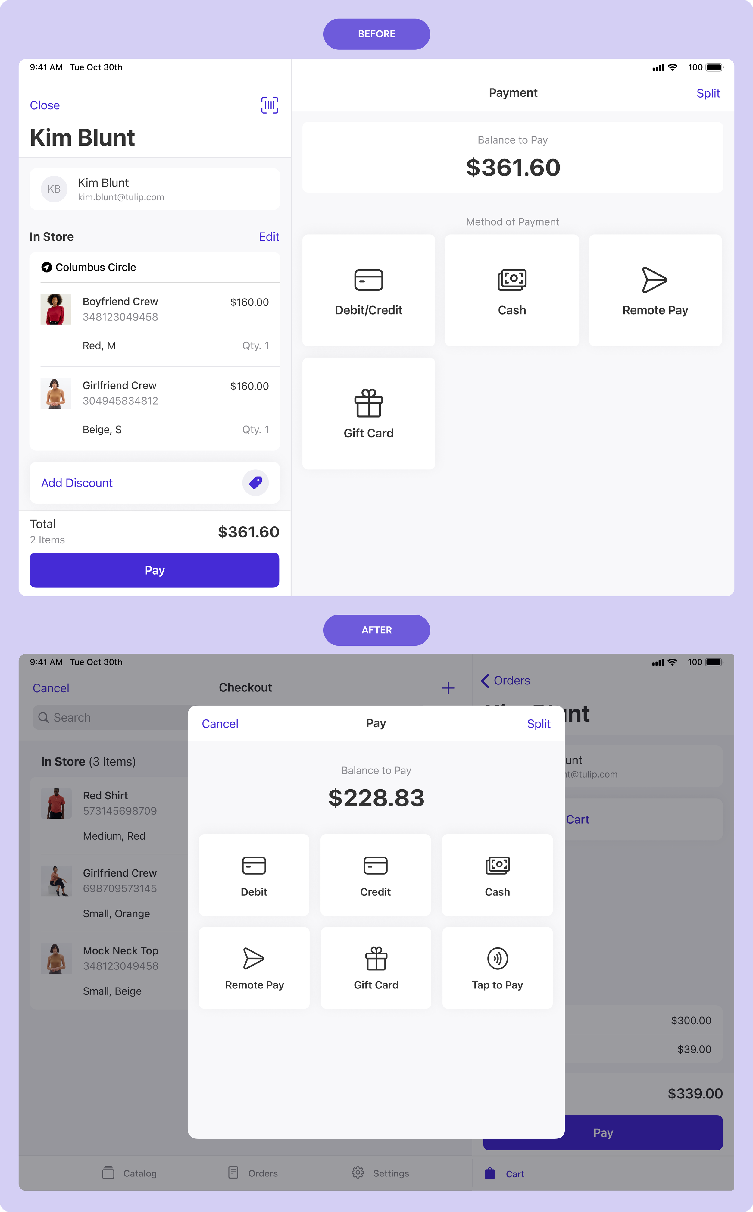
Payment options dominated the screen throughout checkout, competing with the cart for attention and making the experience feel visually busy during an already high-stakes task.
AFTER
Payment methods were moved into a focused modal that appears only when the customer is ready to pay, reducing competing information and helping associates concentrate on completing the transaction accurately.
SOLUTION
Making Larger Transactions Easier
BEFORE
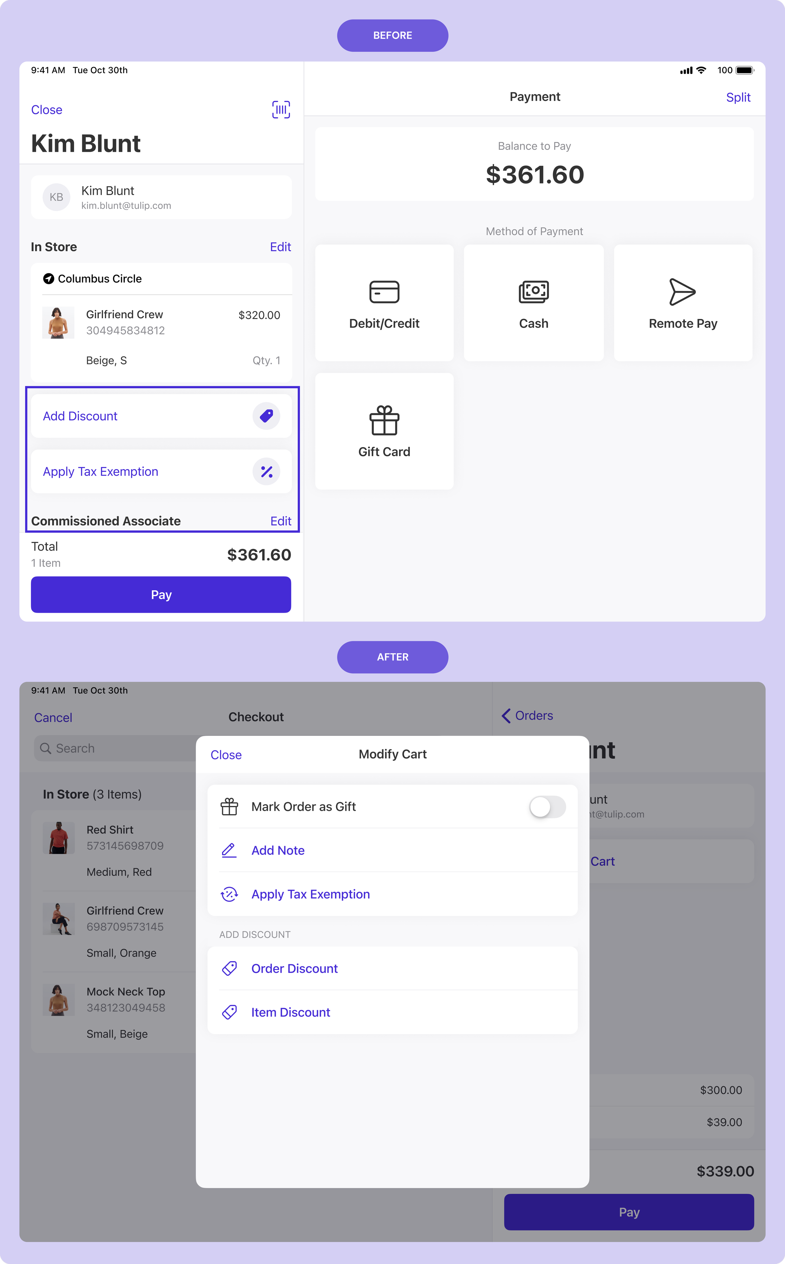
Low-frequency cart actions like discounts, tax exemptions and associate changes lived directly in the checkout panel, competing with product details for limited space.
AFTER
Cart modifications were consolidated into a dedicated modal, keeping the main checkout focused on the basket. Each action then opens into its own full-page flow, giving associates a clearer space to complete one task at a time.
Future
Bring technical dependencies in sooner
Checkout touched several established areas of the product. Mapping those dependencies earlier would make it easier to distinguish interaction improvements from changes requiring deeper architectural work.
Customization as part of the product strategy
The redesign focused on creating a clearer default experience, but a stronger long-term solution may have been to make parts of the POS configurable by retailer. Things like navigation, checkout actions, payment methods and cart tools could adapt to different store formats without requiring separate product experiences.
Scroll down to view next project